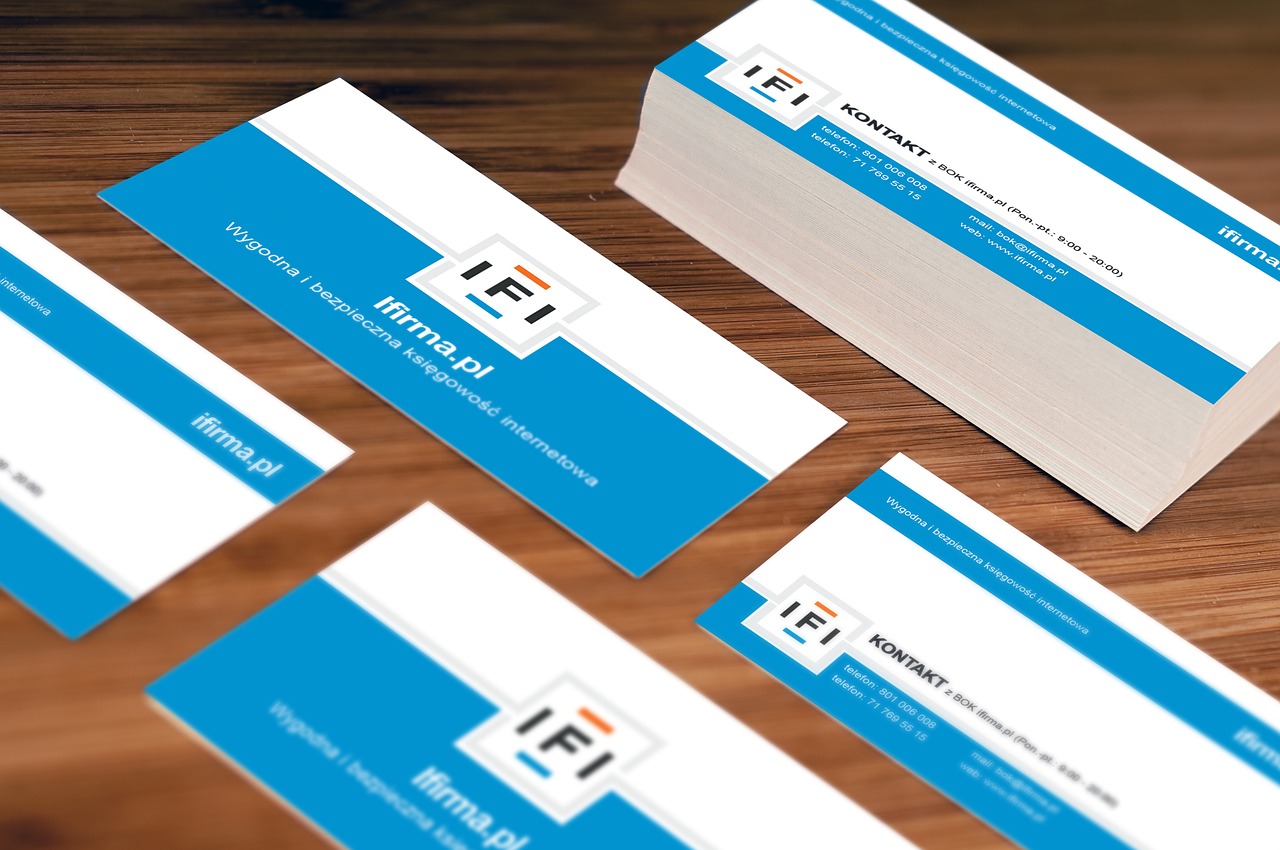
The choices you make about the style, tone and appearance of the brand are of paramount importance. Here’s how they reflect the personality of your business.
Colours
When it comes to the branding of a company, the first thing that comes to mind is colours. In fact, there are some proven associations between colour and mood. However, each person has slightly different associations depending on their individual life experiences, so what we indicate are trends, not rules.
– The Red is bold, exciting and energetic
– The Purple is creative and calm
– The Green is peaceful and natural
– The Yellow is optimistic and positive
– The Orange is fun and confident
– The Blue is strong and reliable
Furthermore, the colour choices have different meanings depending on the sector. Blue, for example, is a classic colour for a bank, while it might be unusual for a bookstore. What are the typical colours in the segment in which you operate? Whether you decide to follow existing standards or break the mould with a whole new approach, the colours you choose to describe your business.
Font
We are passionate about fonts, and we could talk for hours about how to use them in branding. Because fonts have such a rich cultural history, font style can greatly impact how your business is perceived. Here are some considerations:
With thanks or without? Graced fonts are classic and elegant and convey a sense of tradition and authority. The sans serif fonts, on the other hand, are more modern, essential and trendy. Think Times New Roman and Helvetica.
Multiple fonts or just one? The use of various fonts mixed gives a touch of energy and dynamism, indicating a full brand of ideas and novelties. If you use just one font instead, you will give the impression of being a calm, proactive and thoughtful person with an efficient approach to getting things done.
Decorative fonts and scripts With decorative fonts or scripts, you can create a vintage or classic and timeless style. And depending on the font chosen, a style reminiscent of handwriting can also create a more personal and informal feel.
Style of illustrations
Few aspects of design are as important as illustrations, and each artist has their own opinion on how to make editorial or creative images. That said, there are some trends that almost all brands have in common. If you’re using digital illustrations, there are two main categories of images:
The digital vector illustrations, curved and stylized, are modern, informal and well-defined. They are often associated with technology and innovation and are, therefore, very popular among startups. This style is characterized by bold colours and clean lines and is often used for infographics. Vector illustrations are easily editable in Adobe Illustrator CC to create images for printing for the web or mobile applications.
Then there’s the hand-drawn illustration style, which uses lines, hatching, and shading to emphasize your business’s human element, suggesting a sense of creativity and craftsmanship.
Of course, you can insert any artistic element into the brand, from collage to watercolour. Still, we generally recommend choosing analogue formats instead of digital, as they will give your brand a more classic and artisanal connotation.
Tone of voice
Your tone of voice indicates what you choose to say and the way you say it.
Do you use contractions in your brand? Are you talking about yourself in the first person instead of in the third person? (For example, “We started…” not “The Acme Company was founded…”) In this case, the tone of voice is more informal and friendly, making you more accessible to new customers.
A widespread approach to tone is to use lyrical and witty language, which is not easy to achieve as what is witty for one person can be silly for another. But if you do it right, the perception will be of an intelligent, accessible and competent person.
Then there is the minimalist style. If you use short phrases with a few descriptive terms and focus on images or data, your tone of voice suggests that you are a self-confident and quality-oriented person. Let the products and services you offer do the talking.
Whatever your approach, keep in mind that if the brand’s tone were introduced by a sole founder or a staff member, it would only stay in the company as long as they are there. Practice a few style rules to make sure it lasts forever. For more information on how to express your brand’s spirit, please read our guide on creating a brand culture and in our manual on how to create brand values.
The secret ingredient: consistency
A brand is like a sports team: every player is important, but everyone must play as a team. For your brand characteristics ‘team’ to perform well, each element must appear when needed, anytime, anywhere.
If the design is on the piece and the tone of voice is perfect, but you choose fonts randomly and unplanned, yours will never be a winning combination. Likewise, if you have Business Cards that make the brand stand out, but your site’s style is very different, the personality of the brand will not always shine through.
